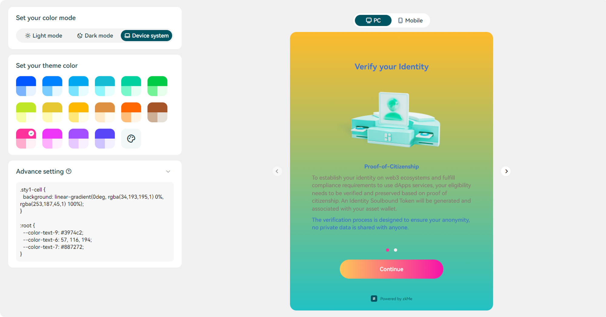
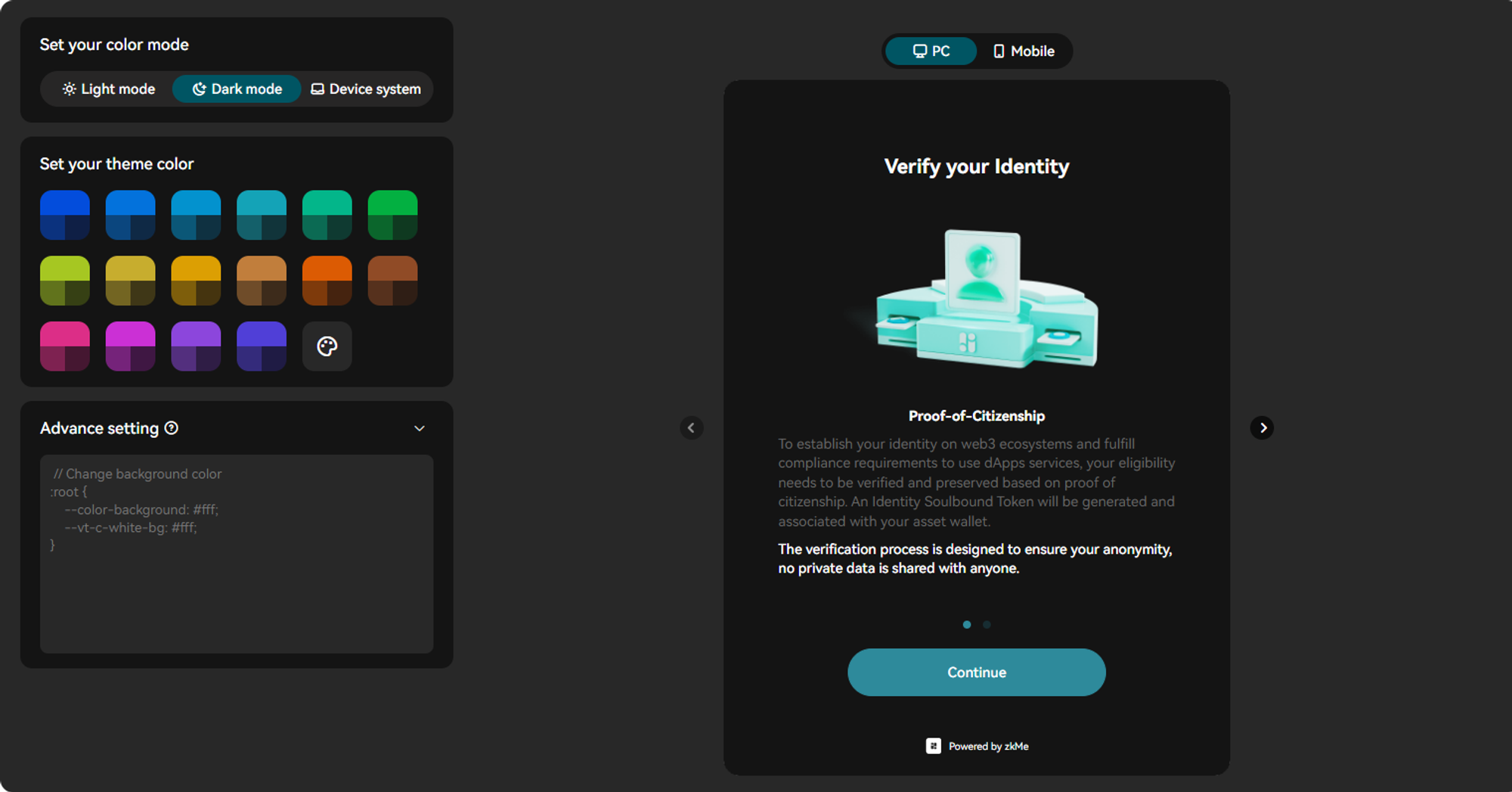
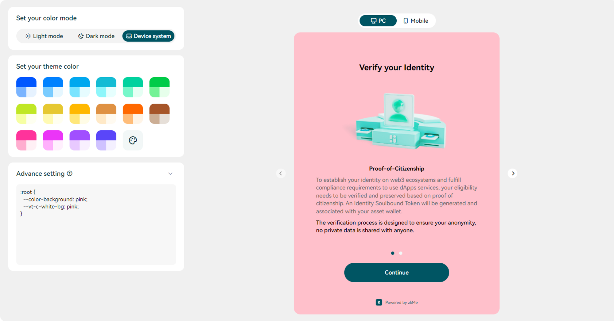
Customize Widget UI
We understand that while our default design style aims to meet a variety of needs, specific projects may require a more tailored approach. Therefore, we've expanded our customization features.
In our dashboard, you now have the ability to alter the zkMe Widget style, including font color, background color, and more. This provides you with the flexibility to adapt the zkMe Widget to fit your project needs or personal preferences effectively.
We will now guide you through the utilization of this feature in detail.
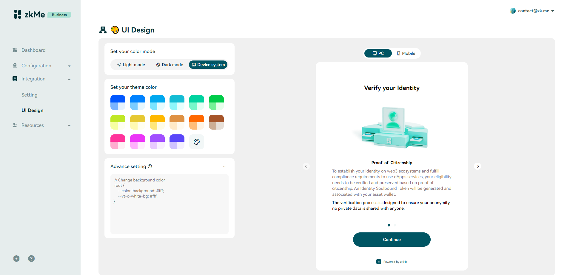
On the left, you'll find our custom editing area. On the right, we display real-time previews, showcasing how the Widget will appear on both PC Browsers and Mobile Devices by clicking the toggle button on the top.
Color Mode
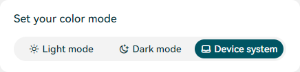
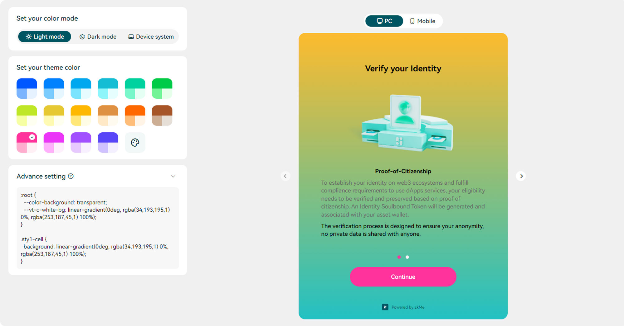
As it stands, the zkMe Widget's default color mode aligns with the system settings. This means that the widget's background color, icon background color, and font color adapt to the display mode on the user's device. However, selecting either Light mode or Dark mode overrides this functionality, meaning the color style will then remain constant, regardless of changes to the user's system settings.
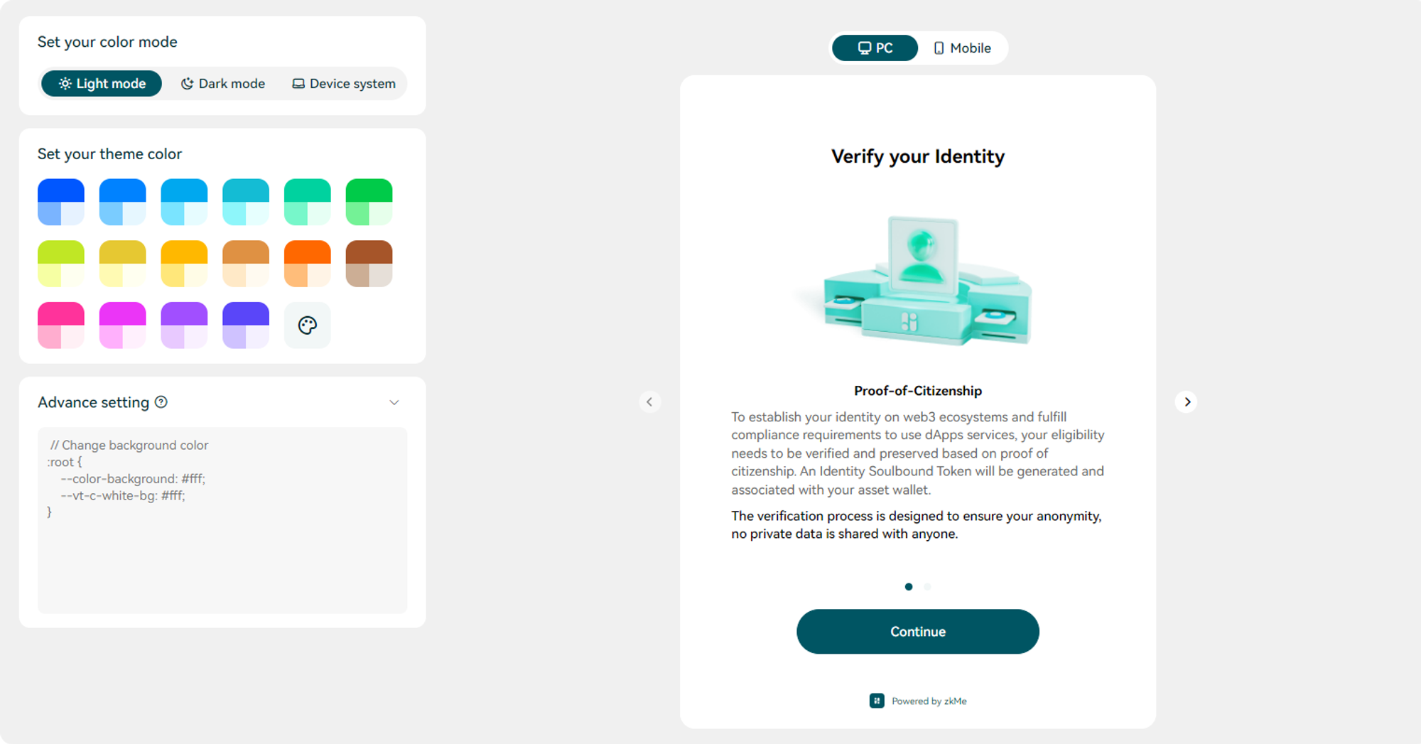
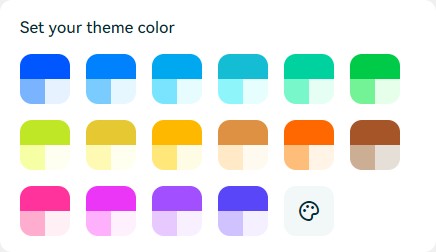
Theme Color
We provide 16 distinct color choices, along with a color palette option in our editor, to ensure a perfect match with your project's theme.
The zkMe Widget will use the following color values when no theme color is set:
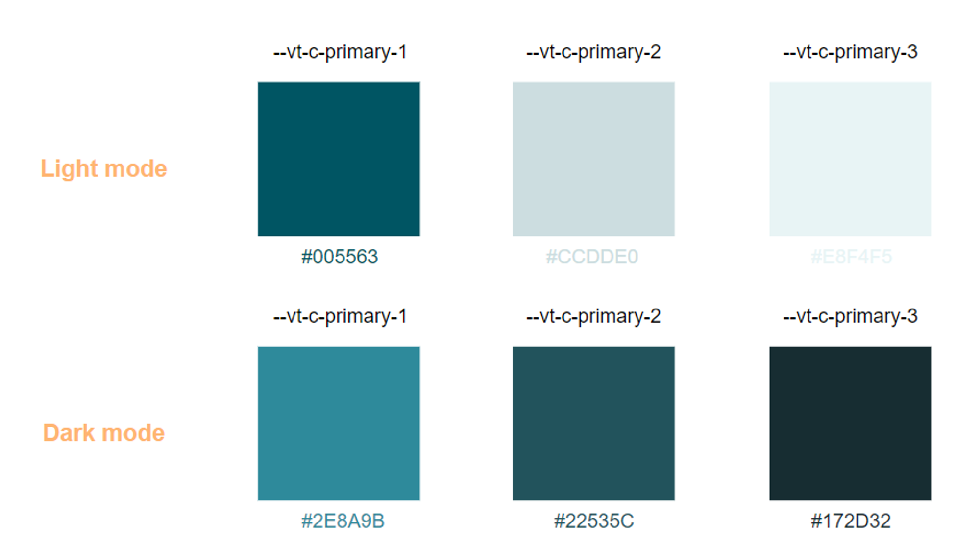
When a color from the palette is chosen, it's designated as -vt-c-primary-1. The remaining two colors are determined using Ant Design's palette tool. If the way these color values are calculated doesn't quite meet your needs, feel free to adjust them by adding your own CSS.
Advance Setting
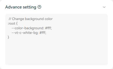
This textarea lets you insert your own CSS to customize the zkMe Widget. If you adjust the color here, it'll take precedence over the theme color selector. We've implemented a few limitations on the custom CSS uploads; actions such as adding pseudo-elements, concealing elements in the widget, or altering the image source of background and icons are not allowed.
To pinpoint and adjust the style of elements within a widget more effectively, you can inspect the specific elements using your browser. Subsequently, you can make alterations based on their class names.
Examples
Here are some straightforward examples to assist you in navigating the Advanced Settings.
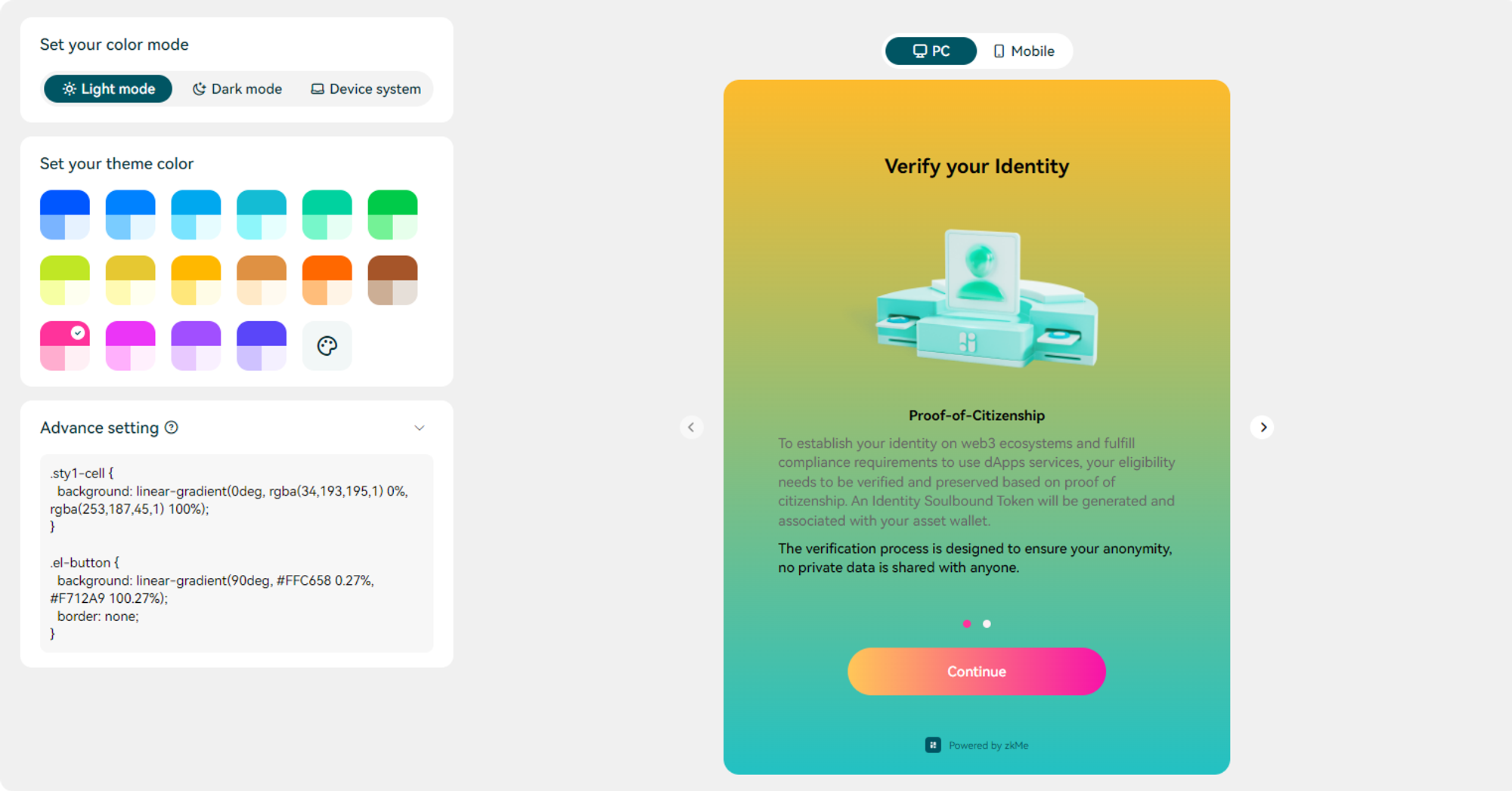
Background Color
To modify the background color of the zkMe Widget to a solid color other than black or white, you may apply the subsequent CSS.
To switch the background color to a gradient, we suggest updating the background of the given class name and adjusting the color attributes --color-background and --vt-c-white-bg.
Button Style
Most of the buttons within the zkMe Widget utilize the el-button class name. This allows you to easily style the Widget's buttons using this class name.
Font Color
To adjust the font color in zkMe Widget, you can generally do so by altering the color attribute of the relevant preset.